Getting dressed can feel like putting together a puzzle, especially when colors set the mood for your day. Nailing color matching basics saves time and boosts confidence instantly.
Style is a creative expression, but understanding how shades work together impacts how professional or relaxed you look. Color matching basics help your clothing complement, not clash.
This guide explains how to use color matching basics in outfits. Read on for practical tips, easy rules, and real-life scenarios you can use right away.
Building a Foolproof Color Palette Grows Your Wardrobe Options
Learning to build your wardrobe around a color palette makes pairing clothing easier every day. Start by choosing simple foundation colors and expand purposefully.
With color matching basics in mind, selecting a palette based on your lifestyle means more combinations and less stress figuring out your outfit each morning.
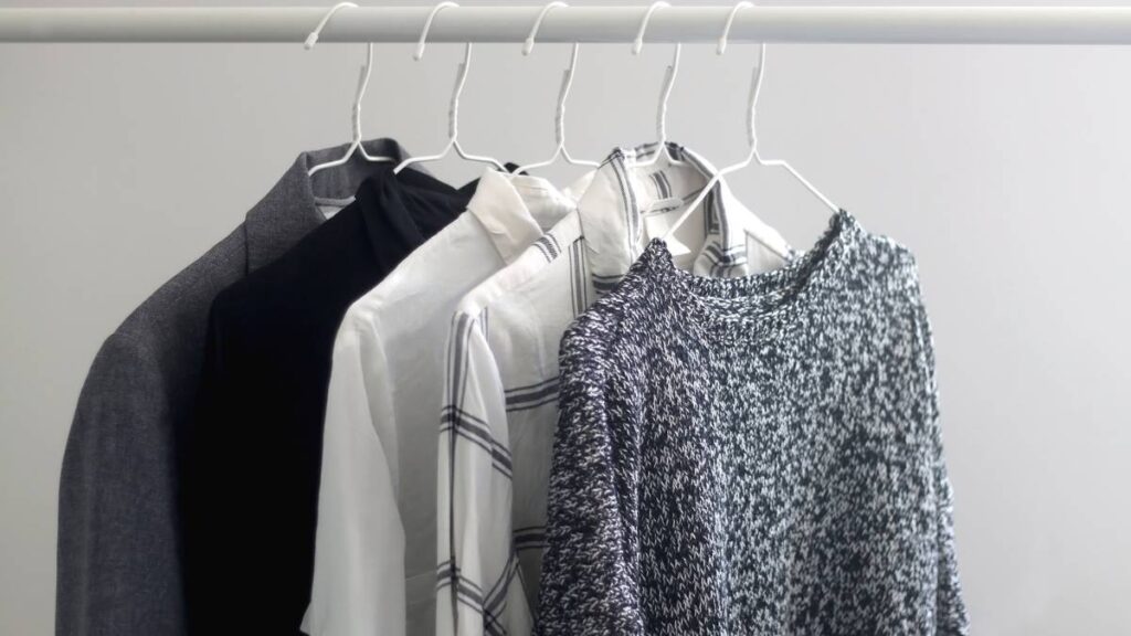
Why Neutral Foundations Keep Your Closet Versatile
Neutrals create a consistent background. A classic white shirt and tan chinos work anywhere. Owning these staples means nearly every additional color or pattern will match them.
For example, navy and beige look great with bolder pieces, giving you more flexibility each time you get dressed. This is why style professionals rely heavily on neutral items.
Make a checklist: do you have a white, black, navy, and beige top or bottom? If not, that’s the first step to smarter color matching basics.
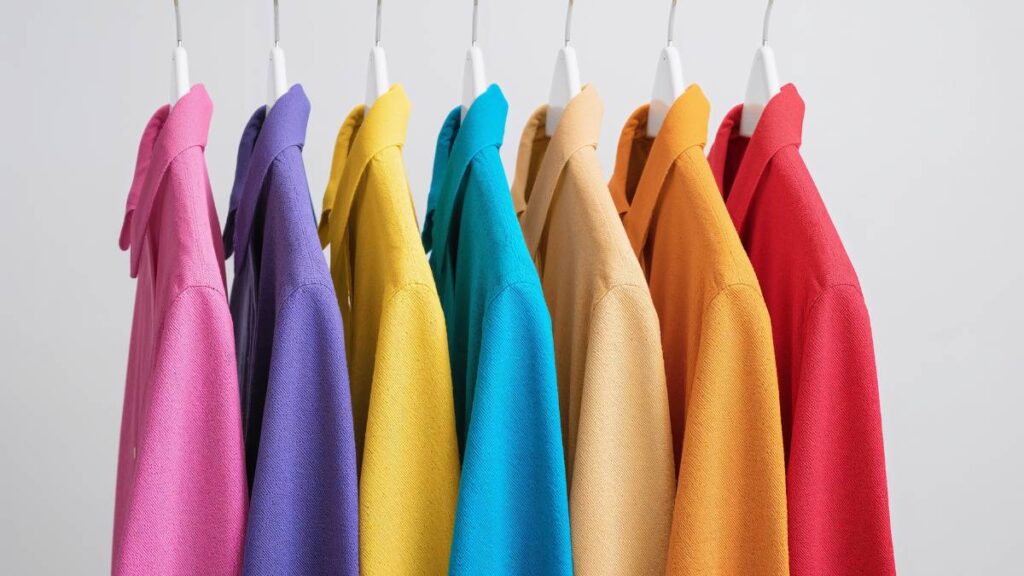
Bridging Outfits With Key Accent Colors
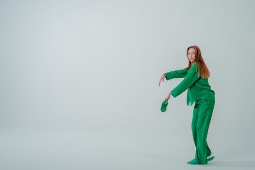
Accent colors bridge neutrals and bring personality into outfits. Try a green sweater or a burgundy top; both can refresh basic ensembles without overwhelming your look.
Think of selecting accent colors as seasoning food: a little goes a long way, and they should enhance—not overpower—your palette. Rotate two or three accent shades depending on season or mood.
Example script: “Today, I’ll pair my navy pants with a mustard cardigan. The pop of color highlights the whole outfit, keeping me looking polished and intentional.”
| Neutral Color | Good Accent Pairing | Best Occasions | Takeaway |
|---|---|---|---|
| Black | Red, Royal Blue | Evening, Work | Use for contrast; striking for formal looks |
| White | Pastels, Navy | Casual, Business | Keeps things bright; suitable for warmer months |
| Navy | Yellow, Green | Work, Everyday | Adds depth while staying understated |
| Beige | Forest Green, Rust | Casual, Daytime | Earthy feel, anchors bold accents |
| Gray | Burgundy, Teal | Business, Urban | Flexible; almost any accent matches easily |
Pairing Clothing Using Simple Color Rules Streamlines Decision Making
Rules like complementary, analogous, or monochromatic schemes lead to balanced outfits. Each system uses color matching basics in practical, repeatable ways for daily style.
Instead of second-guessing a pairing, rely on straightforward color rules for fast, sharp outfits. Here’s how to put these basics to work.
Applying the Complementary Color Rule
Pairing opposite hues on the color wheel creates bold, dynamic results—think blue with orange or red with green. Use this when you want your look to stand out.
For instance, someone says, “I’ll grab a navy blazer and pair it with a burnt orange scarf today—classic, but with extra energy.” This approach works reliably for event outfits.
- Pair blue tones with orange accents. This grabs attention and works for evening or creative work events where a statement matters.
- Try green shirts with deep red accessories. The subtle clash excites the eye, perfect for seasonal occasions or holidays.
- Use yellow and purple for spring or summer looks. It channels fun and vibrancy without relying on prints or patterns.
- Anchor bright choices with neutral pants or skirts, focusing the contrast up top and keeping the base understated and practical.
- Switch to muted versions of complementary colors, like sage green and dusty rose, for lighter, daytime-friendly combinations.
Bonus script: “Grabbing my rust skirt makes it easy to pick a teal top—those opposites guarantee outfit harmony using just color matching basics.”
Designing Outfits With Monochromatic Schemes
Stick to one color in different shades. Pair a sky blue shirt with navy jeans for visual depth and instant style coherence—it’s virtually impossible to mismatch.
Layering similar tones is calm and polished. If you’re unsure, start with one base color you feel comfortable in, then add lighter or darker pieces in that family.
- Choose two-tone blues (light polo, dark jeans) for an easy, cohesive casual look ready in seconds.
- Add a gray cardigan to break up a single-color outfit gently, using shades of black or white if a pure tie isn’t available.
- Red layers (maroon shirt, cherry trousers) feel bold but grounded—copy this when you want to look intentional with minimal thought.
- Try olive and army green together for low-contrast, approachable style on errand days or casual Fridays at work.
- Layer three subtle grays with pattern or texture changes for extra visual interest besides just color matching basics.
Tip: Monochrome always looks coordinated. This reduces time spent evaluating combinations and builds reliable, stylish habits quickly.
Testing Seasonal Color Choices Leads to Fresh, Current Looks
Rotating your palette with the seasons means your outfits always feel fresh and context-appropriate. Seasonal color matching basics adapt your look without requiring new clothes.
Apply this to your next shopping trip by scanning for colors that bring variety as the weather changes, rather than stocking up on neutrals all year long.
Expanding With Spring and Summer Brights
Brighter shades signal spring and summer—incorporate pastels or light primary colors for a breezy, modern feel. Light blue with pale yellow is a simple way to lighten a basic set.
For example, try pairing blush pink tees with white or tan pants. This introduces warmth and energy without requiring bold prints or busy patterns.
Copy this: “I swap in my mint green shorts and powder blue shirts once temperatures start rising.” Focusing on light accents keeps the look current every year.
Adapting to Autumn and Winter Tones
Heavier, deeper colors like burgundy or forest green align with autumn trends. These shades pair naturally with existing neutrals—think camel coats with dark green scarves.
Mixing textures, such as corduroy with wool, can boost visual impact further. Select rust, mustard, or eggplant for instant seasonal updates on familiar pieces.
Example: “Wearing my burnt orange cardigan with olive pants helps my outfit look thoughtful in cooler months.” Refer back to color matching basics for guidance in all weather.
Accessorizing With Color Creates Impact Without Overwhelm
Let accessories handle your boldest color statements. Small splashes—shoes, belts, jewelry—offer easy entry to more adventurous color matching basics without dominating your entire outfit.
Picking Colorful Shoes for Subtle Statements
Try cobalt blue loafers with a gray dress or red sneakers paired with all-black. Shoes introduce flair from the ground up in a controlled, polished way.
Consider sneakers in pastel tones for spring—start with a neutral outfit, then slip on a pair in lilac, sage, or lemon for a lighthearted accent.
Tonight, going out? Swap business shoes for a daring hue, letting your footwear lead the conversation while basics up top keep things balanced.
Using Scarves, Bags, and Jewelry as Color Pivots
A mustard bag can energize a navy suit or a turquoise necklace can liven up even the plainest white tee. Accessories are cost-effective for updating seasonal trends.
To avoid clashing, select only one focus piece per outfit—this keeps accents intentional and prevents distractions that might dilute your overall look.
Checklist for color matching basics and accessories: choose one color pop, keep everything else neutral or muted, and space accents away from direct competition (like not pairing hat and shoes).
Fitting Patterns and Prints Into Smart Color Coordination
Wearing prints requires recognizing the main color and echoing or complementing it elsewhere in your outfit. Busy prints work best against plain backdrops and vice versa.
Color matching basics will help even the most chaotic pattern feel natural by linking at least one color in the print to a solid elsewhere.
Reading a Print to Choose Match Points
Isolate the dominant color in a busy floral: if red stands out, pick a red accessory or pair with red shoes to create harmony instantly.
Use the print as a cheat sheet for all solid items—draw any color from the pattern and bring it out in other parts of your outfit for coherence.
This tip holds across stripes, florals, plaids, and geometric prints: spot the anchor color and copy it as a solid, or pick a neutral to keep things calm.
Pairing Solids With Patterns Strategically
If your trousers feature a sharp plaid, go for a solid, quiet shirt in a matching or complementary color family. The focus remains on the standout piece without competition.
This makes prints work for professional environments or high-stakes settings where you want to look intentional, not accidental, with your choices each morning.
Color matching basics turn a pattern’s energy into a tool, not a stumbling block—test new matches by simplifying everything else in the look.
Bringing Personal Flair Into Classic Color Combinations
Classic combos like black and white, navy and camel, or gray and burgundy stay in style because they’re flexible. Adding signature touches keeps your look uniquely yours every time.
Borrowing Inspiration From Iconic Outfit Pairings
Copy iconic color matchups—think Audrey Hepburn’s black dress and pearls or a camel trench over navy separates. Use these as templates and tweak small details to suit your taste.
For Sunday brunch, grab a navy polo and khaki chinos. Use color matching basics to swap in a playful belt or pastel socks as the finishing touch.
Swap a white T-shirt for a stripe or throw on a red scarf with a black blazer. These small steps bring traditional outfits back to life without needing a complete overhaul.
Testing Out New Color Pairings in Small Doses
If you’re uncertain, trial new combos in low-commitment settings—weekend coffee runs, casual dinners, or after-hours work events are perfect proving grounds.
Note what excites you and what feels unnatural. Document which color matches won compliments and which pairing got overlooked so you can fine-tune your color matching basics.
Try, reflect, and keep what works. The goal is to make experimenting with color matching basics part of your weekly style rhythm—not a source of anxiety.
Practical Takeaways for Lasting Style Confidence
Experimenting with color matching basics makes putting together polished outfits easy, not daunting. Focus on versatile palettes and simple accent rules that fit your lifestyle and preferences.
The tips in this article let you build seamless outfits every day, refresh your look seasonally, or put your own spin on proven style classics—all by using color matching basics.
Every time you get dressed, use these strategies to simplify choices and express your personal flair. Smart color matching basics are your shortcut to dressing with intent and ease.